fenice
When we started this project we didn’t have a blank paper. The brief of SF was very precise and most of the technologies used had already been selected.
We also had a heavy store of traditions related to the brand values that we couldn’t ignore. The aim was to create the new reference absolute speaker, produced in limited series, which would be the archetype of a new generation of products.
We wanted to redesign and reconsider everything from head to foot; we thought that some of the items that are commonly used in this kind of product can be totally redesigned. This project was to steer all the knowledge and technology of Sonus Faber into the future, but it had been clearly specified to keep some of the core values of the brand like the traditional materials, the accurate craftsmanship, the unique construction methods.
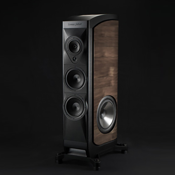
We wanted the new product to have all the innovations that the latest audio knowledge and technologies could grant. We started looking for new ideas by studying musical instruments and semantic references or icons. In the specification there had already been decided that the side walls would have a double curve to make them as strong as possible. The decision was to use the lyre icon, as associated with Mediterranean mythology, both for its design and its musical qualities.
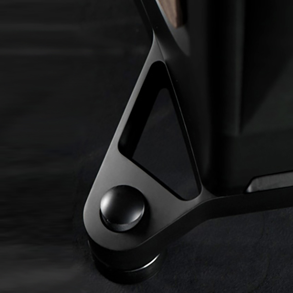
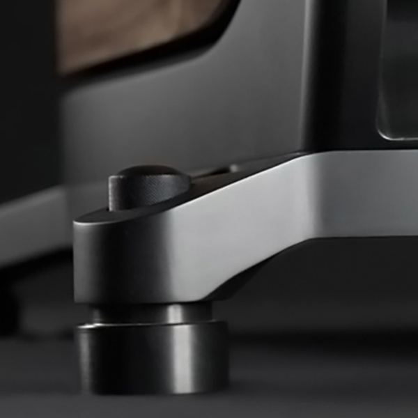
The development and brainstorming phase brought new elements connected to technology and style: new ideas and concepts had to be used to achieve the perfect silence of the body itself. The base and feet needed to be one of the items to be worked on to obtain greater innovation.
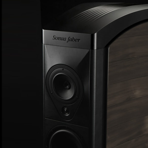
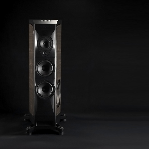
The front panel as in the brief had to show continuity with the traditional SF multifaceted front. The materials used had to embody traditions and sophisticated technologies; we chose to strength the body with three enormous aluminum blocks, making the object visually powerful and material and, like with race car components, we chose to leave the signs of the cnc process visible.
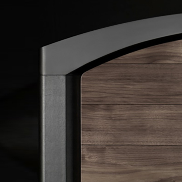
We decided to keep the side shape dynamic: the strong visual presence due to its big volume (almost 250 liters) needed dynamic, streamlined sides and sharp edges to represent the quality and precision of the airy sound details. The double thickness of the sides was visually disconnected from the body and became like two halves of a clamshell.
The result is the combination of tradition and innovation and it resulted in a revolutionary product in a very conservative market; its success was proved by the fact that most of the planned production was sold within the first week after its launch.
